Data Analytics and Visualisation
2024-02-05
About Me
- I love traveling with my partner and trying new types of food

- Doing angels landing
Who is the Good Data Institute?

What is data analytics
- Who has heard of ETL?

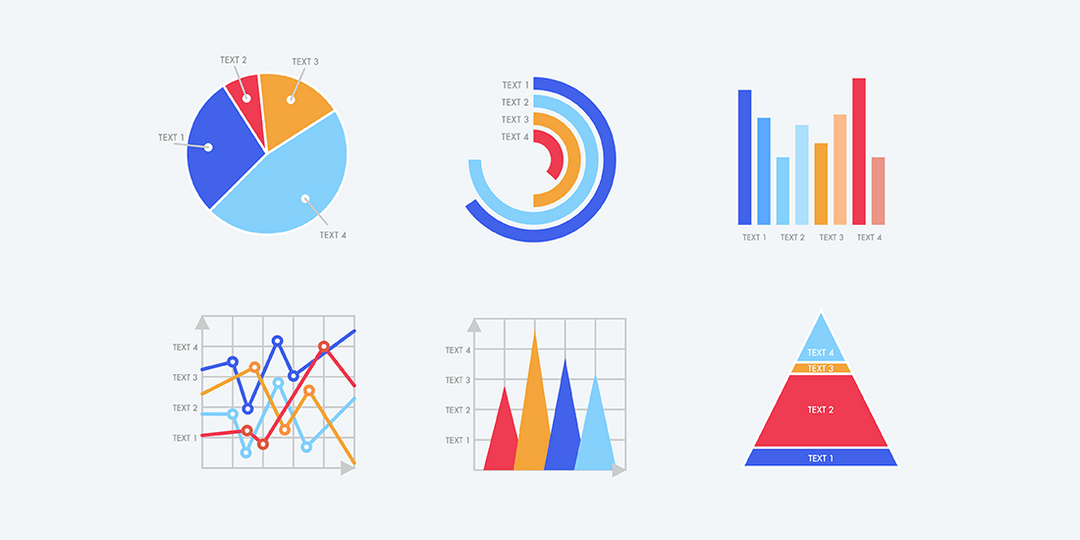
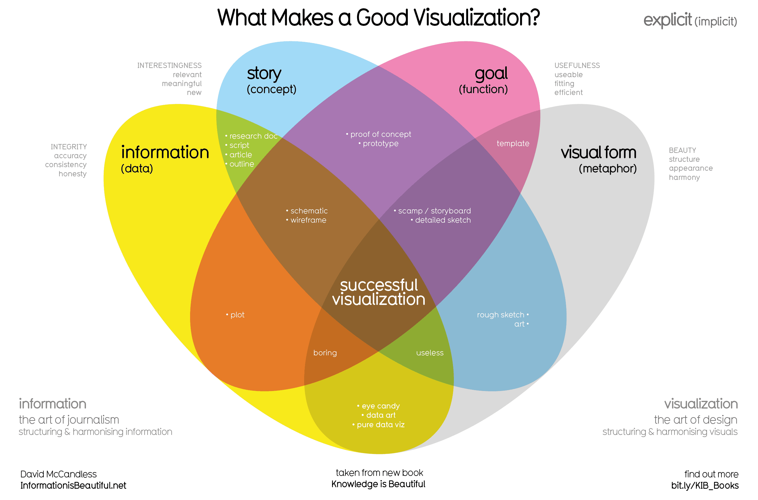
Data Visualisation
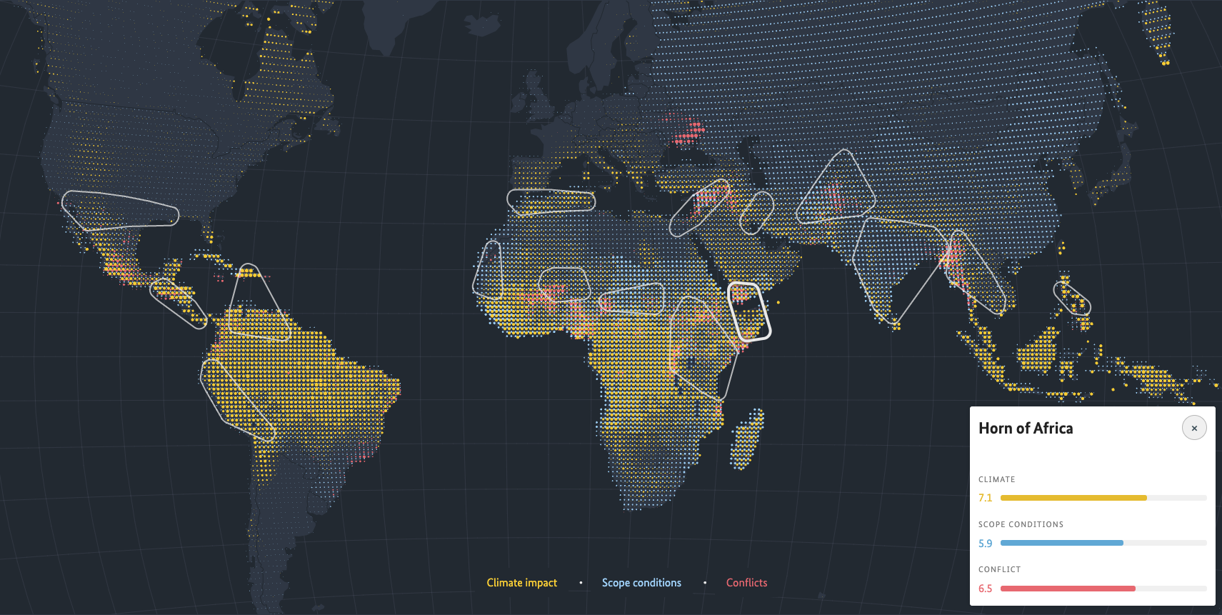
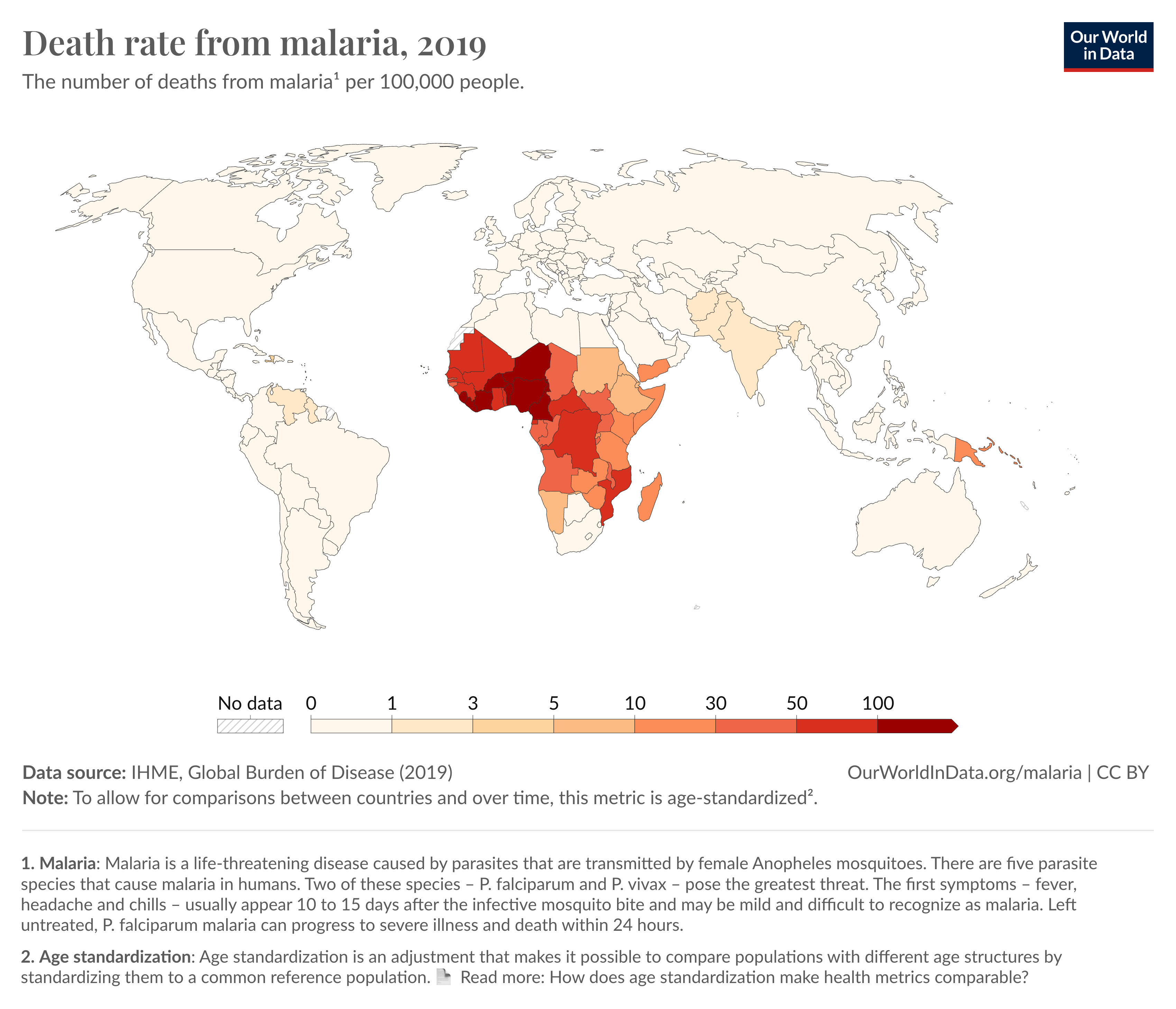
Example - Climate & Conflict
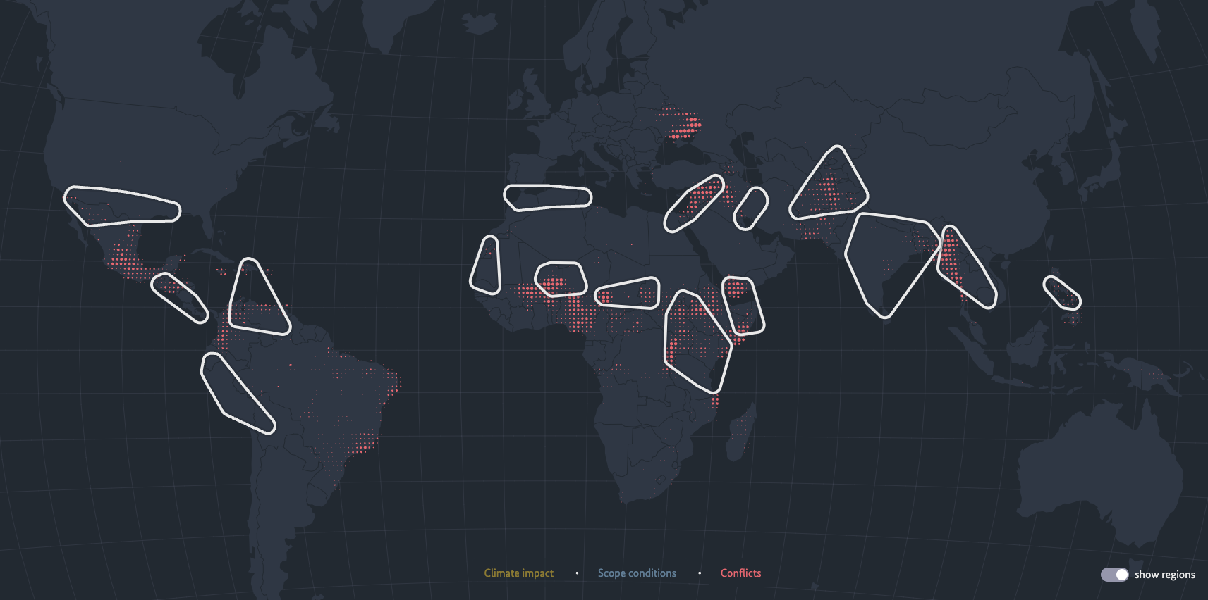
Example - Climate & Conflict
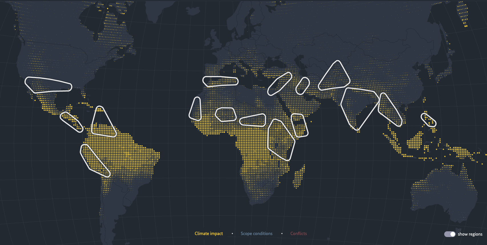
::: {.notes}cli This is an example of a data visualisation that shows the impact of climate change on conflict around the world. The visualisation uses color, size, and position to show the relationship between climate change and conflict. The data is presented in a way that is engaging and easy to understand, making it more likely that people will pay attention and remember the key points. :::
Example - Climate & Conflict
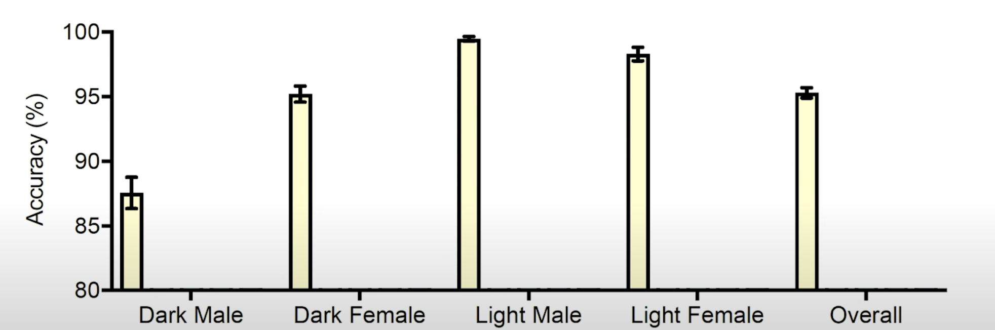
Trivial Example

- Predictions on the image of the Western bride included labels such as “bride”, “wedding”, “ceremony”
- For the woman wearing a traditional Indian wedding dress, the predicted labels were “costume”, “performing arts”, “event
More Harmful Example
\[ P(\text{Dark}) \lt P(\text{Light}) \]
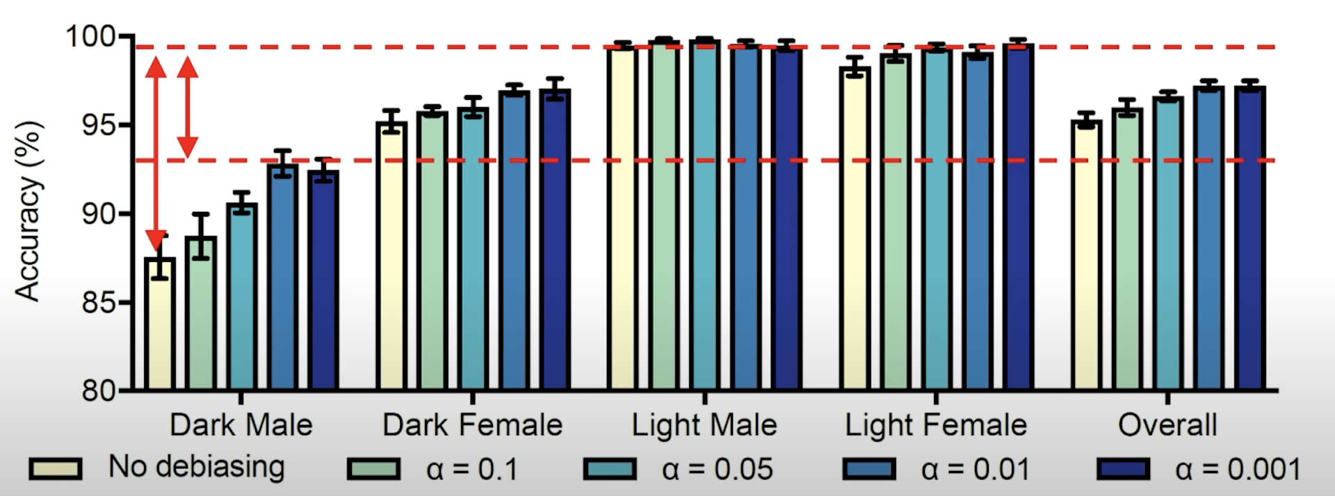
More Harmful Example
\[ P(\text{Dark} \cap \text{Male}) \lt P(\text{Dark} \cap \text{Female}) \lt \\ P(\text{Light} \cap \text{Female}) \lt P(\text{Light} \cap \text{Male}) \]
More Harmful Example
- What happens when you try and use a de-biasing parameter \(\alpha\) to reduce that bias.
Caring Kids Australia

Caring Kids Australia
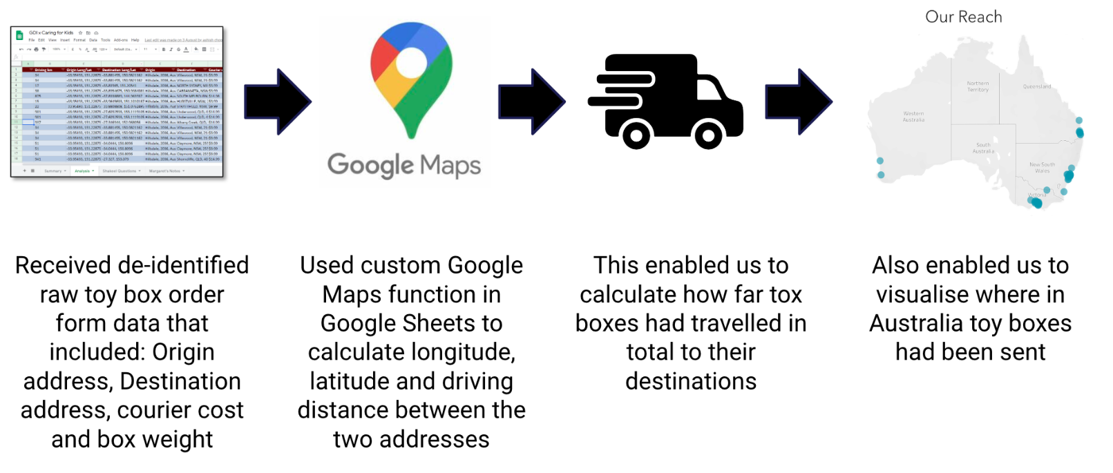
Caring Kids Australia
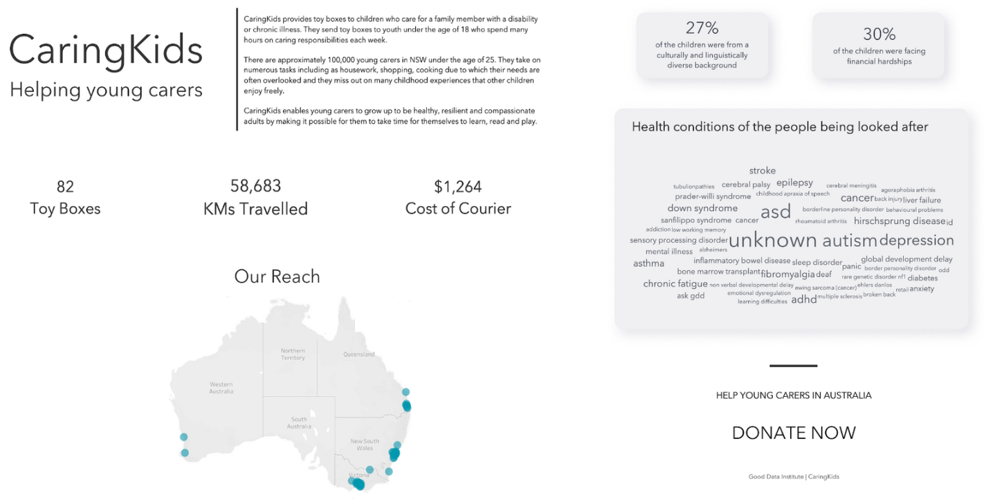
Where are all the projects located?
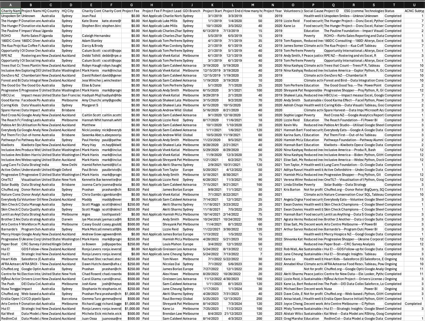
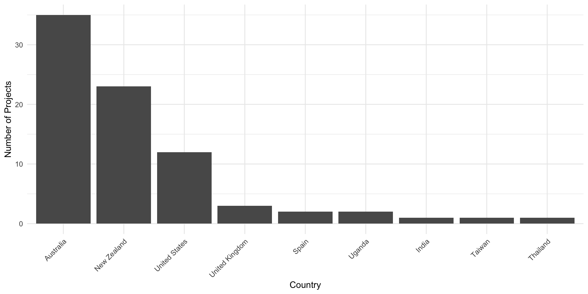
Real Example (using R)
- What do you think of this visualisation?
Real Example (using R)
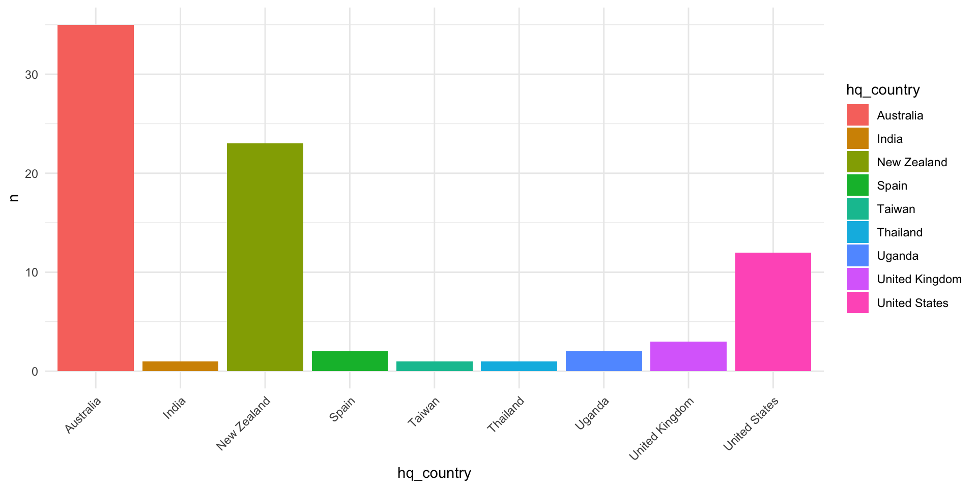
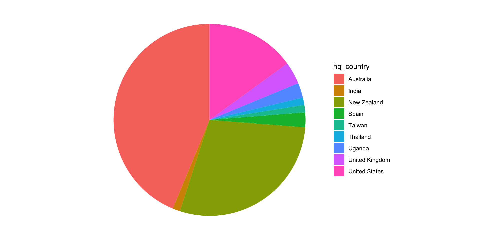
Proper Data Visualisation
Comparison
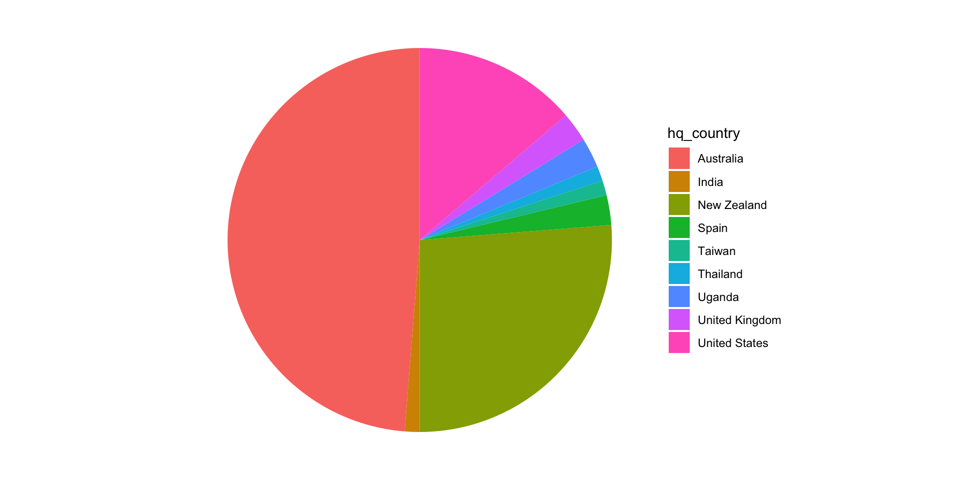
- Pie Chart 🥧
- Hard to distinguish between the parts of a circle
- So many colors, hard to process
- Not the best choice for this data
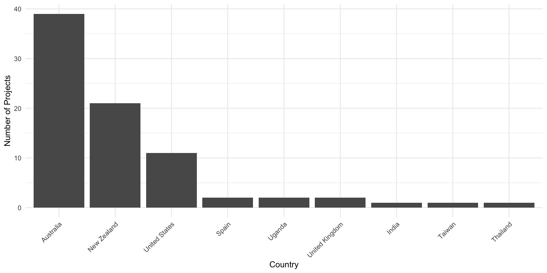
- Bar Chart 📊
- Easier to read and understand
- Reordered by number of projects
- Clear labels
Question: Whats missing for both?
More advanced visualisation
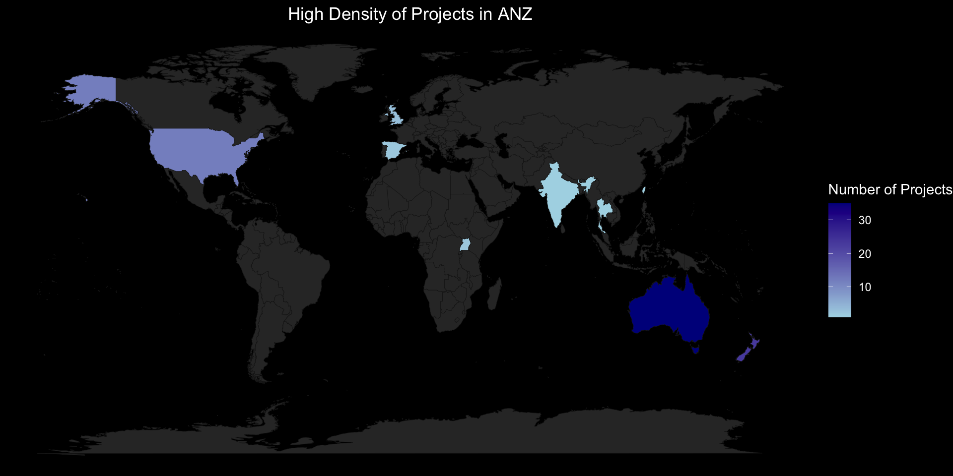
What might this visualisation struggle to communicate?
Pipeline Dreams with

Solution
Solution
Map code
library(maps)

# Map data preparation with country name adjustments
d_projects <- d_projects %>%
  mutate(hq_country = case_when(
    hq_country == "United States" ~ "USA",
    hq_country == "United Kingdom" ~ "UK",
    TRUE ~ hq_country
  ))


# Load world map data
world_map <- map_data("world")

# Join your project data and prepare the map data
map_data <- world_map %>%
  left_join(d_projects %>%
              count(hq_country, name = "n_projects"), by = c("region" = "hq_country")) %>%
  replace_na(list(n_projects = NA))

# Plotting the map
ggplot(map_data, aes(x = long, y = lat, group = group, fill = n_projects)) +
  geom_polygon(color = "#1C1C1C", size = 0.15) +  # Adjust border color for better visibility on dark background
  scale_fill_gradient(low = "lightblue", high = "darkblue", name = "Number of Projects", na.value = "#313131") +
  labs(title = "Number of Projects by Headquarters Country", x = "", y = "") +
  theme_void() +
  theme(
    text = element_text(color = "white"),  # Changes text color to white
    plot.background = element_rect(fill = "black", color = NA),  # Dark plot background
    panel.background = element_rect(fill = "black", color = NA),  # Dark panel background
    panel.grid.major = element_blank(),  # Adjust grid color and size
    panel.grid.minor = element_blank(),  # No minor grid
    plot.title = element_text(color = "white", hjust = 0.5),  # Title in white and centered
    axis.text = element_blank(),  # Remove axis text
    axis.ticks = element_blank(),  # Remove axis ticks
    legend.background = element_rect(fill = "black", color = NA),  # Dark legend background
    legend.text = element_text(color = "white")  # White legend text
)![]()